![]()
Regarding Home decor color trend 2025 Interior colors are not just shades we choose for walls or sofas، they’re a deep expression of the human condition at any given time. Just as fashion, music, and even food trends evolve, so do the colors that shape our living spaces, reflecting how we feel and respond as individuals and as a society.
The difference between a décor color in 2020 and one in 2025 isn’t merely visual،it reflects a collective emotional shift. After years of global isolation and uncertainty, there emerged a need for warmth, comfort, and emotional security. That’s where colors like Peach Fuzz and Sand Beige appeared،as visual answers to emotional questions.
Technological progress and environmental awareness have also played a role in shaping our choices. Colors like Olive Green and Warm Copper don’t just evoke nature; they suggest a deeper human connection with the environment. Meanwhile, tones like Soft Black and Deep Burgundy have emerged to express renewed strength and inner boldness.
Choosing a color for a new year is no longer just a surface-level or commercial decision،it’s a precise reflection of a global mood, seeking balance and redefining beauty from the inside out.
A Quick Look at Home decor color trend 2025: From Retreat to Reconnection

Over the past few years, the world of interior design has witnessed color shifts that clearly mirror the emotional and social states humanity has gone through. After the 2020 pandemic, there was a literal and figurative return inward،a desire for safety and tranquility within the home. The colors that emerged during that time were neutral and comforting: shades of gray, beige, and deep olive green. These tones were designed to be a soothing backdrop to an unstable world.
In 2021, colors like Ultimate Gray and Illuminating Yellow were announced by Pantone, reflecting a symbolic contrast between resilience (gray) and optimism (yellow). By 2022, we saw a stronger embrace of earthy hues and a growing fondness for nature-inspired palettes: Terracotta, Warm Taupe, and a wide range of greens،from olive to grassy tones.
By 2023 and 2024, neutral shades continued to dominate, but warmer and bolder tones began to emerge gradually،burnt orange, misty blue, and dusty lavender among them. This evolution wasn’t random; it was a clear response to people’s need for expression and a more relaxed return to life.
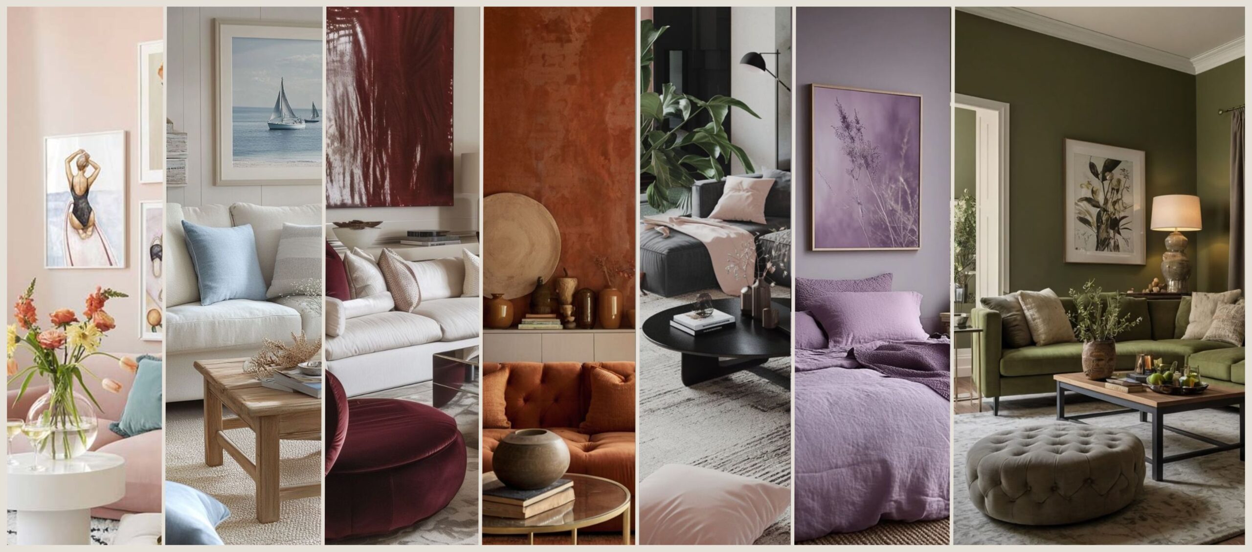
About Home decor color trend 2025, a new emotional shift is evident: color is no longer just about calm and relaxation،it now embraces tenderness, depth, and belonging. That’s why we see shades like Peach Fuzz leading the year, along with soulful and balanced colors like Dusty Lavender, Olive Green, and Warm Copper،which we’ll explore in detail in the following sections.
Global Trends Shaping the Colors of 2025: Where Collective Emotion Meets Artificial Intelligence
The colors of 2025 didn’t emerge from a vacuum،they are a natural result of major shifts the world has undergone. From emotional transformation after the pandemic to the accelerating influence of artificial intelligence, and a deepening environmental awareness that’s more present now than ever before.
The first driving force is the need for emotional comfort. After years of psychological pressure and social isolation, there was a collective craving in interior design for spaces that feel like a “warm hug.” That’s where Peach Fuzz came in،its soft, peachy hue serves as a quiet yet powerful representation of tenderness and emotional containment. It doesn’t shout،it whispers serenity.
Secondly, nature. With rising environmental concerns and a push toward sustainability, earth-inspired colors have reclaimed their space. Olive Green, Sand Beige, and Warm Copper are not just visually pleasing،they evoke a deeper sense of returning to roots, honest materials, and breathing spaces.
Third, artificial intelligence has entered the scene،not as an aesthetic tool, but as a data-driven force shaping trends. Smart design tools now analyze millions of images, user preferences, and visual behavior to suggest color schemes based on real patterns. Thanks to this, overlooked hues like Dusty Lavender are being reintroduced, resonating with the subtle, emotional palette of the modern user.
Finally, we’re witnessing a new harmony between privacy and boldness in design. Designers no longer hesitate to use colors like Deep Burgundy or Soft Black, as these tones are no longer associated solely with darkness or rebellion،they now stand for confidence, depth, and a clear identity.
The colors of 2025 aren’t just a passing trend،they’re a new visual language, written with human emotion, decoded through technology, and refined by society and sustainability.
Peach Fuzz: Color of the Year 2025… Between Tenderness and a Warm Identity
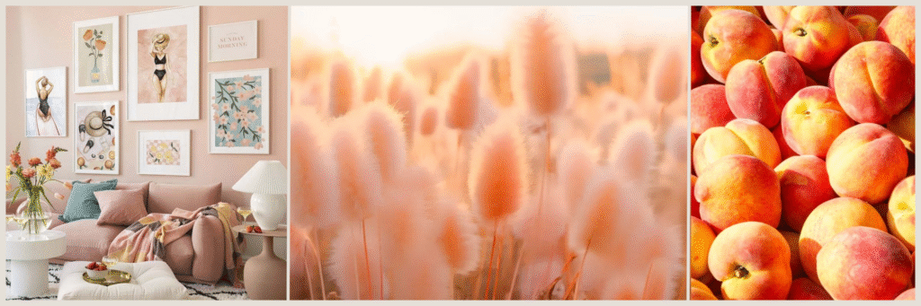
Each year, Pantone introduces a color that reflects the global mood and emerging trends،and for 2025, the choice is Peach Fuzz: a soft peach hue that blends warm pink with a hint of light orange. It represents a deeply human moment in a rapidly shifting world.
What makes this color special is that it’s neither loud nor dull،it pulses with gentleness and calm. It’s not a color that demands attention, but rather one that quietly anchors presence. You could call it the color of a warm touch, a peaceful morning, or a home that embraces you.
Peach Fuzz is highly versatile, making it ideal for various rooms in the home. In bedrooms, it brings a sense of serenity and romance. In living rooms, it adds a welcoming, elegant tone. And when used in bathrooms or reading corners, it creates a soft visual balance that pairs beautifully with beige, warm white, or subtle touches of copper and muted gold.
What elevates Peach Fuzz even more is its symbolism. In an age where everything moves fast, this color reminds us to slow down،to return to human warmth and gentle connection. It’s a color that embraces the senses without overwhelming them, offering a quiet breath amid the noise of modern life.
In practical use, Peach Fuzz is both a safe and refreshing choice: unconventional, yet not unfamiliar. New, yet comfortingly natural. Whether on walls, soft furnishings, rugs, or decorative accents،it adds depth without disrupting harmony.
Olive Green: Nature’s Reassurance and the Elegance of Continuity
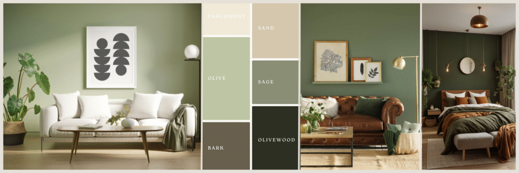
In the world of modern interior design, few colors manage to strike the delicate balance between neutrality and character, between calm and identity. But Olive Green does it effortlessly. With its strong presence in the 2025 color palette, this tone proves it’s more than just a color،it’s a mindset.
Inspired by the enduring leaves of the olive tree, Olive Green symbolizes stability, maturity, and a deep-rooted connection to nature. In a year where people are seeking inner balance amid global chaos, this color offers a visual grounding،a soothing field for the eyes that fosters a sense of belonging.
One of Olive Green’s greatest strengths is its versatility. It blends seamlessly with earthy tones like Sand Beige or Warm Copper, and with raw materials like unfinished wood for a rustic or bohemian elegance. It can be used as a primary wall color in serene spaces like bedrooms or home offices, or as a supporting shade in sofas, curtains, or even modern kitchens.
This shade is also perfect for those who embrace quiet minimalism،designers and homeowners who shy away from visual noise but still crave emotional richness. Olive Green is like a form of meditation: silent, yet full of life on the inside.
Psychologically, this color enhances focus and tranquility, making it ideal for workspaces, reading corners, and reflective areas. In 2025, Olive Green represents the “deep breath” among bolder shades،guaranteeing balance in any color scheme, no matter how vibrant or saturated.
Misty Blue: Visual Clarity and a Whisper of Calm
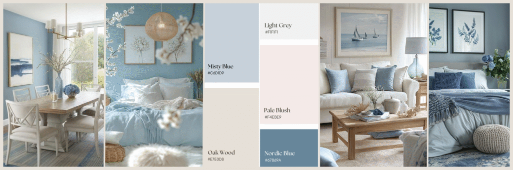
If every color carries a specific emotional energy, then Misty Blue is the one that whispers comfort, not shouts excitement. It’s a blue softened by a veil of gray, holding within it a rare balance between coolness and warmth, intellect and emotion. In 2025, this color stands out as one of the heroes of the new color story،reflecting our modern human need for peace, balance, and inner connection.
Misty Blue is neither a true blue nor a pure gray،it occupies that gentle space in between, where the eye pauses to reflect. That’s precisely what makes it ideal for spaces that require long-term psychological ease: bedrooms, home offices, serene bathrooms, or even welcoming guest rooms.
This tone is perfect for designs that seek purity and simplicity without being cold or sterile. It pairs beautifully with other hues like Dusty Lavender, Sand Beige, or Soft Black, creating a palette that’s visually rich yet calm. It also works exceptionally well with light metals such as brushed nickel or polished silver.
Misty Blue is a natural fit for soft modernism or Scandinavian design styles, delivering a clear message: “I’m here to organize your thoughts, not overwhelm them.”
Psychologically, this color is known to reduce stress, enhance focus, and promote a sense of control, which is why it’s becoming a top recommendation for smart homes, mindfulness corners, and even therapy clinics with calming aesthetics.
In 2025, Misty Blue offers a quiet pause in a noisy palette،a small space of serenity, where we can recenter ourselves in an ever-changing world.
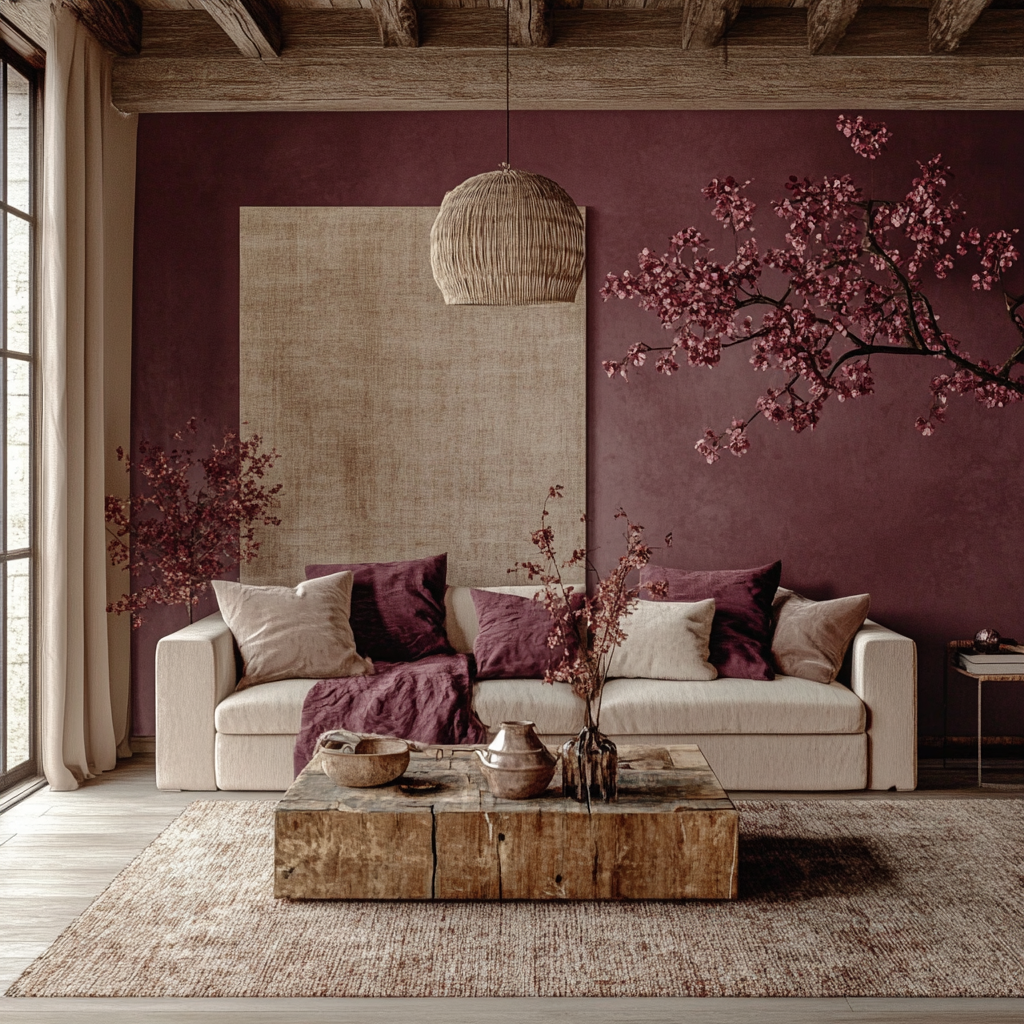
Deep Burgundy: Subtle Luxury with Unforgettable Presence
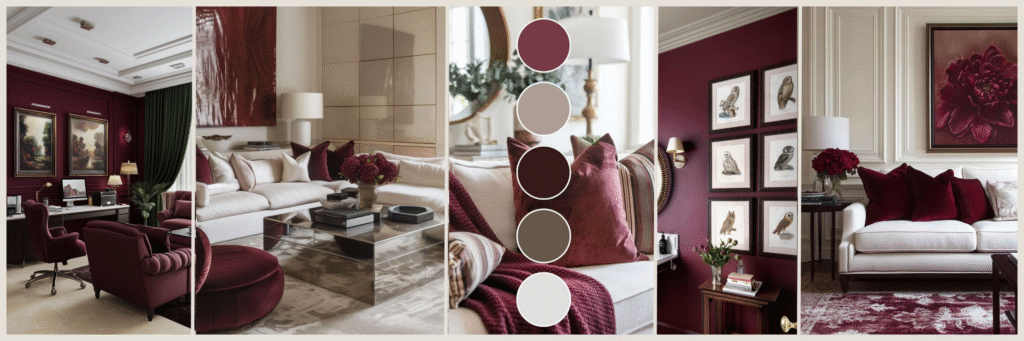
Among all the colors of 2025, Deep Burgundy emerges as one of the most mysterious and elegant. It’s not just a color،it’s a bold visual statement, blending the warmth of red with the nobility of purple to create a mood that’s rich in sophistication and psychological depth. This color didn’t make the list by chance; it’s here to prove that boldness no longer means chaos،it means intentional expression.
In a world of repeating neutrals, Deep Burgundy offers a chance to inject strong personality into any space. Whether used on a feature wall, an armchair, or even in small accent pillows, it draws attention without being intrusive, adding a refined dramatic layer that stirs emotion.
It pairs beautifully with materials like velvet, natural leather, and dark wood, and blends smartly with softer shades like Peach Fuzz or Misty Blue to create a balanced atmosphere filled with warmth and comfort.
Deep Burgundy can be used in several settings:
- Dining rooms, where it enhances a sense of formality and opulence.
- Entryways, creating a strong and memorable first impression.
- Bedrooms, especially for headboards or accent walls.
- Home offices, where it fosters deep thinking and creativity.
Psychologically, this color is known for boosting confidence, emotional grounding, and refined taste. It’s the choice of those who are unafraid to express themselves،but with quiet elegance and lasting impact.
In 2025, Deep Burgundy isn’t a color for risk-takers،it’s the color of maturity. It speaks not with volume, but with clarity and conviction.
Sand Beige: The New Neutral, Spoken in a Warm Tone
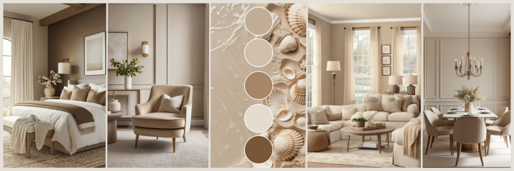
While some colors aim to attract attention and stand out, others prefer to stay in the background،but with intention. Sand Beige, or sandy beige, is one of those quiet tones that doesn’t scream for the spotlight, yet forms the backbone of any successful design. In 2025, it’s no longer viewed as a boring shade, but rather as an essential, smart, and warm color that effortlessly ties all design elements together.
What makes Sand Beige special is its inherent neutrality paired with a gentle warmth. Unlike colder neutrals like gray, this shade creates a welcoming feel and reflects sunlight softly within a space, making it ideal for homes that rely onnatural lighting.
This color is perfect for walls, flooring, and even key furniture pieces like sofas and cabinetry. It also serves as a great base for layering bolder or softer hues such as:
- Peach Fuzz and Olive Green for an organic, balanced feel.
- Deep Burgundy and Soft Black for added depth and sophistication.
- Misty Blue or Dusty Lavender for a soft, contemporary contrast.
In modern interiors, Sand Beige also enhances natural materials like raw wood, rattan, linen, and limestone. It’s a color that doesn’t steal the light،it reflects it،making it more than just a backdrop. It becomes the foundation of warmth and visual harmony in any space.
Psychologically, Sand Beige symbolizes stability, simplicity, and clarity. It helps reduce stress and fosters a sense of trust and emotional containment, which is why it’s often used in clinics and family-oriented home designs.
In essence, Sand Beige is the voice of mindful, quiet design،no need to shout to be heard, nor to over-decorate to impress.
Warm Copper: Sophisticated Radiance and Handcrafted Elegance
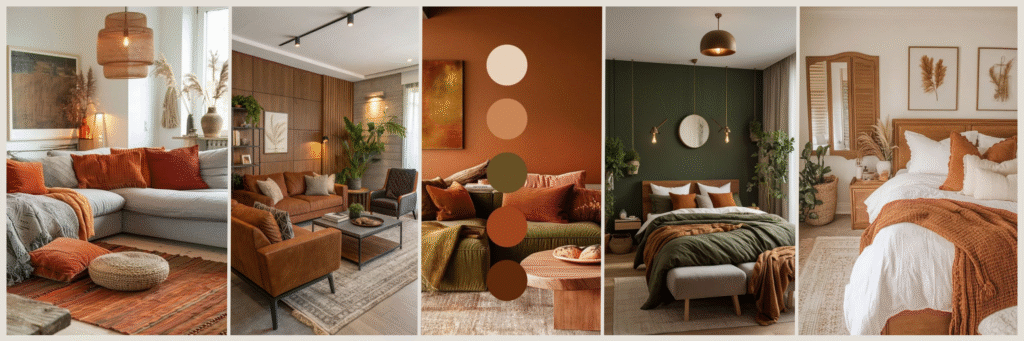
In the 2025 color lineup, Warm Copper stands out as one of the most emotionally evocative and light-reflective shades. It’s more than just a color،it’s a visual texture that combines richness and warmth, giving any space a refined, celebratory character without being flashy.
This shade draws its charm from natural metals and that soft gleam reminiscent of the sun’s glow at dusk. That’s what makes it ideal for adding elegant accents and expressive detail without requiring major design overhauls.
Warm Copper can be incorporated in various ways:
- Lighting fixtures: such as pendant lights or table lamps, where it reflects light in a cozy, inviting manner.
- Hardware and accessories: like faucets, mirror frames, or table bases.
- Furniture pieces: including side tables or metallic chairs with a copper sheen.
- Kitchens: through exposed sinks or cookware, creating a vintage vibe with a modern twist.
What gives Warm Copper its distinct status is its remarkable ability to harmonize with other colors:
- With Peach Fuzz and Sand Beige, it creates a warm, organic palette.
- With Soft Black and Deep Burgundy, it brings bold contrast and rich drama.
- With Misty Blue or Olive Green, it softens the coolness and restores balance.
Emotionally, Warm Copper conveys warmth, creativity, and mature energy. It’s not a loud color, but one that exudes stability with a hint of nostalgia, celebrating the authenticity of craftsmanship and tradition.
In short, Warm Copper is the color that gives value to the details. As the design world continues to embrace handcrafted aesthetics and authentic materials, this shade stands out as a symbol of refined warmth and understated luxury.
Soft Black: Measured Depth and Subtle Sophistication
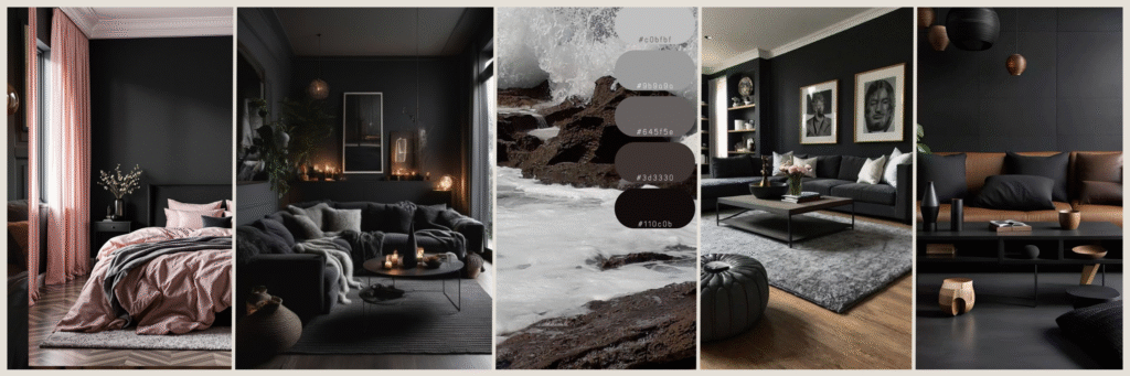
Black has long been associated with power, drama, and boldness. But in its Soft Black form،as it appears in the 2025 design trends،it becomes gentler, more intimate, and less aggressive, without losing its commanding presence. This is black reimagined: not rebellious or loud, but smart, thoughtful, and refined.
Soft Black isn’t glossy or jet-dark،it comes with a matte finish, rich in nuance. That makes it far more adaptable in modern interiors. It’s no longer used as an overpowering backdrop, but rather as a way to highlight details, frame elements, or create elegant focal points.
Where can Soft Black be used?
- Window and door frames, to accent architectural lines without closing in the space.
- Furniture pieces, especially in metal or dark wood for tables, chairs, or cabinetry.
- Accent walls, behind beds, bookshelves, or fireplaces to add visual depth.
- Kitchens, through matte appliances or cabinetry for a sleek, modern look.
When paired thoughtfully, Soft Black works beautifully with warm tones like Warm Copper and Peach Fuzz, and creates strong balance with lighter hues like Sand Beige and Misty Blue. It can be seen as a “silent color”،one that doesn’t shout, but says a lot about taste and balance.
Psychologically, Soft Black conveys containment, depth, and confidence. It’s not about grabbing attention, but about implying understated luxury. It’s the kind of color that makes a space feel more mature،without feeling heavy.
In 2025 interiors, Soft Black is the smart touch that adds confidence and elegance… without ever demanding the spotlight.
Dusty Lavender: Soft Sophistication with Feminine Calm
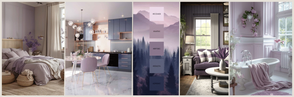
Among the emotionally gentle colors of 2025, Dusty Lavender stands out as a shade that perfectly balances feminine softness with mental clarity. This muted, grayish-purple holds a quiet internal energy, making it ideal for those seeking harmony without losing their individuality.
Dusty Lavender is the color of contemplation, serenity, and sensory warmth. It’s well-suited for:
- Bedrooms, to create a romantic and soothing ambiance.
- Reading or meditation corners, where it enhances focus and relaxation.
- Textiles and soft furnishings, such as cushions or curtains, adding calm without dullness.
This color pairs gracefully with tones like Misty Blue, Sand Beige, and even Soft Black. It can serve as a primary or secondary color depending on the lighting and textures used in the space.
On a psychological level, Dusty Lavender evokes inner peace, balance, and understated beauty, making it a favorite among those who prefer gentle elegance over overt boldness.
Zory’s Touch: How AI Helps You Choose the Perfect Colors for Your Home
With so many choices and personal styles, selecting the right color for your space can feel overwhelming. That’s where Zory steps in،an AI-powered design tool that helps you visualize, test, and coordinate your home’s colors like a pro, even if you’re not an interior design expert.
- Upload a photo of your space, and Zory will suggest the best colors from the 2025 palette, based on the room size, lighting, and existing furniture.
- Instant simulations allow you to preview how Peach Fuzz looks in your bedroom, or how Deep Burgundy feels in a reading nook.
- Smart blending recommendations show you how to mix colors and materials without clashing or visual noise.
- Ongoing suggestions are refined based on your taste and behavior within the app،offering a fully personalized design experience.
With Zory, choosing colors becomes less of a guessing game and more of an inspiring visual journey, driven by creativity and backed by intelligence.
Conclusion: Between Boldness and Balance… 2025 Colors Create a Home That Breathes Your Personality
What defines the 2025 interior color palette is its smart balance between intentional boldness and lively neutrality. It’s not a year of loud colors or muted tones،it’s a year of colors that know what to say, and when to say it.
Colors like Deep Burgundy and Soft Black are no longer reserved for the elite or drama enthusiasts،they’ve become tools to express inner confidence and mature taste, elevating any space without overpowering it. These are colors that choose their moment, enhancing a design with quiet strength.
On the other hand, shades like Sand Beige and Peach Fuzz are redefining neutrality. They’re no longer silent backgrounds،they are joyful foundations spoken in a soft voice. These tones give warmth to rooms, foster tranquility, and create spaces that welcome everyday life with grace.
The strength of this year’s palette lies in its ability to create a visual dialogue،each color tells a part of your story, and each combination becomes a reflection of your personality.
And with intelligent tools like Zory, that story is no longer exclusive to professional designers،it’s now in your hands, to write with your own touch, in your own style, and in a way that truly feels like you.
